
搜索到
2
篇与
的结果
-
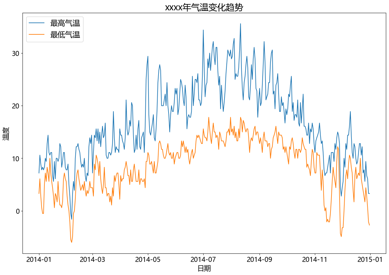
 二、matplotlib - 统计图 - 案例 (1)温度、降水量分析import pandas as pd import matplotlib.pyplot as plt from matplotlib import rcParams rcParams['font.family'] = 'Microsoft YaHei' # data df = pd.read_csv('static/2_pandas/data/weather.csv') # print(df.head()) df['date'] = pd.to_datetime(df['date']) df = df[df['date'].dt.year == 2014] # 设置图表大小 plt.figure(figsize=(15, 10)) # 气温趋势变化图 plt.plot(df['date'], df['temp_max'], label='最高气温') plt.plot(df['date'], df['temp_min'], label='最低气温') plt.title('xxxx年气温变化趋势', fontsize=20) plt.legend(loc='upper left', fontsize='xx-large') plt.xlabel('日期', fontsize=16) plt.ylabel('温度', fontsize=16) plt.xticks(fontsize=15) plt.yticks(fontsize=15) plt.show()# 设置图表大小 plt.figure(figsize=(10, 5)) # 降水量直方图 data = df[df['date'].dt.year == 2014] plt.hist(data.precipitation, bins=5) plt.title('xxxx年降水量统计(直方图)', fontsize=16) plt.xlabel('降水量', fontsize=12) plt.ylabel('天数', fontsize=12) plt.show()
 -
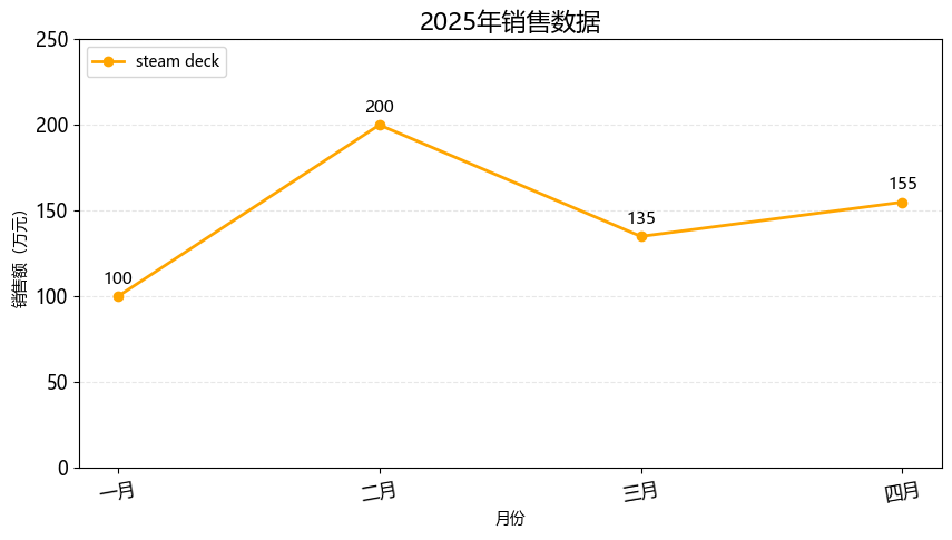
一、matplotlib - 统计图 # 安装依赖 pip install matplotlib1. 折线图import matplotlib.pyplot as plt from matplotlib import rcParams rcParams['font.family'] = 'Microsoft YaHei' # 设置图表大小 plt.figure(figsize=(10, 5)) month = ['一月', '二月', '三月', '四月'] sales = [100, 200, 135, 155] # 绘制折线图 plt.plot(month, sales, label='steam deck', color='orange', linewidth=2, marker='o') # 标题 plt.title('2025年销售数据', fontsize=16) # 坐标轴标签 plt.xlabel('月份') plt.ylabel('销售额(万元)') # 图例 plt.legend(loc='upper left') # 背景 plt.grid(axis='y', alpha=0.3, linestyle='--') # 设置刻度的样式(可选) plt.xticks(rotation=10, fontsize=12) plt.yticks(rotation=0, fontsize=12) # y轴范围 plt.ylim(0, 250) # 在每个坐标点上显示数值 for x, y in zip(month, sales): plt.text(x, y + 5, str(y), ha='center', va='bottom', fontsize=11) plt.show()2. 条形图import matplotlib.pyplot as plt from matplotlib import rcParams rcParams['font.family'] = 'Microsoft YaHei' # 设置图表大小 plt.figure(figsize=(10, 5)) subjects = ['语文', '数学', '英语', '思政'] scores = [93, 96, 60, 90] # bar 纵向柱状图 plt.bar(subjects, scores, label='学生:孙笑川', width=0.3) # 标题 plt.title('期末成绩', fontsize=16) # 坐标轴标签 plt.xlabel('科目') plt.ylabel('分数') # 图例 plt.legend(loc='upper left') # 背景 plt.grid(axis='y', alpha=0.3, linestyle='--') # 设置刻度的样式(可选) plt.xticks(rotation=0, fontsize=12) plt.yticks(rotation=0, fontsize=12) # y轴范围 plt.ylim(0, 100) # 在每个坐标点上显示数值 for x, y in zip(subjects, scores): plt.text(x, y + 5, str(y), ha='center', va='bottom', fontsize=11) # 自动优化排版 plt.tight_layout() plt.show()import matplotlib.pyplot as plt from matplotlib import rcParams rcParams['font.family'] = 'Microsoft YaHei' # 设置图表大小 plt.figure(figsize=(10, 5)) subjects = ['孙笑川', '药水哥', 'Giao哥', '刘波'] scores = [9.3, 9.6, 8.0, 9.0] # barh 横向柱状图 plt.barh(subjects, scores, label='成绩', color='orange') # 标题 plt.title('50米短跑成绩', fontsize=16) # 坐标轴标签 plt.xlabel('用时') plt.ylabel('学生') # 图例 plt.legend(loc='upper right') # 背景 plt.grid(axis='x', alpha=0.3, linestyle='--') # 设置刻度的样式(可选) plt.xticks(rotation=0, fontsize=12) plt.yticks(rotation=0, fontsize=12) # x轴范围 plt.xlim(0, 15) # 在每个坐标点上显示数值 for index, score in enumerate(scores): plt.text(score + 0.5, index, f'{score}', ha='left', va='bottom', fontsize=11) # 自动优化排版 plt.tight_layout() plt.show()3. 饼图import matplotlib.pyplot as plt from matplotlib import rcParams rcParams['font.family'] = 'Microsoft YaHei' # 设置图表大小 plt.figure(figsize=(10, 5)) things = ['看书', '电影', '游泳', '做饭', '其他'] times = [1.5, 2, 1, 2, 0.5] # 配色 colors = ['red', 'skyblue', 'green', 'orange', 'yellow'] # autopct 显示占比 # startangle 初始画图的角度 # colors 饼图配色 # wedgeprops 圆环半径 # pctdistance 百分比显示位置 plt.pie(times, labels=things, autopct='%.1f%%', startangle=90, colors=colors, wedgeprops={'width': 0.6}, pctdistance=0.6) # 标题 plt.title('每日活动时间分布', fontsize=16) plt.text(0, 0, '总计:100%', ha='center', va='bottom', fontsize=10) # 自动优化排版 plt.tight_layout() plt.show()import matplotlib.pyplot as plt from matplotlib import rcParams rcParams['font.family'] = 'Microsoft YaHei' # 设置图表大小 plt.figure(figsize=(10, 5)) things = ['看书', '电影', '游泳', '做饭', '其他'] times = [1.5, 2, 1, 2, 0.5] # 配色 colors = ['red', 'skyblue', 'green', 'orange', 'yellow'] # 爆炸式饼图,设置突出块 explode = (0, 0.2, 0.1, 0, 0.05) # autopct 显示占比 # startangle 初始画图的角度 # colors 饼图配色 # wedgeprops 圆环半径 # pctdistance 百分比显示位置 plt.pie(times, labels=things, autopct='%.1f%%', startangle=90, colors=colors, pctdistance=0.6, explode=explode, shadow=True) # 标题 plt.title('每日活动时间分布', fontsize=16) plt.text(0, 0, '总计:100%', ha='center', va='bottom', fontsize=10) # 自动优化排版 plt.tight_layout() plt.show()4. 散点图import matplotlib.pyplot as plt from matplotlib import rcParams rcParams['font.family'] = 'Microsoft YaHei' # 设置图表大小 plt.figure(figsize=(10, 5)) month = ['一月', '二月', '三月', '四月', '五月', '六月'] sales = [100, 200, 135, 155, 210, 235] # 绘制散点图 plt.scatter(month, sales) # 标题 plt.title('2025年上半年销售趋势', fontsize=16) # 自动优化排版 plt.tight_layout() plt.show()import matplotlib.pyplot as plt from matplotlib import rcParams import random rcParams['font.family'] = 'Microsoft YaHei' # 设置图表大小 plt.figure(figsize=(10, 5)) x = [] y = [] for i in range(500): temp = random.uniform(0, 10) x.append(temp) y.append(2 * temp + random.gauss(0, 2)) # 绘制散点图 plt.scatter(x, y, alpha=0.5, s=20, label='数据') # 标题 plt.title('x、y 变量趋势', fontsize=16) # 坐标轴标签 plt.xlabel('x变量') plt.ylabel('y变量') # 图例 plt.legend(loc='upper left') # 背景 plt.grid(True, alpha=0.3, linestyle='--') # 设置刻度的样式(可选) plt.xticks(rotation=0, fontsize=12) plt.yticks(rotation=0, fontsize=12) # y轴范围 # plt.ylim(0, 30) # 回归线 plt.plot([0, 10], [0, 20], color='red', linewidth=2) # 自动优化排版 plt.tight_layout() plt.show()5. 箱线图import matplotlib.pyplot as plt from matplotlib import rcParams rcParams['font.family'] = 'Microsoft YaHei' # 设置图表大小 plt.figure(figsize=(10, 5)) data = { "语文": [88, 82, 85, 89, 91, 80, 79, 83, 87, 89], "数学": [90, 91, 80, 67, 85, 88, 93, 96, 81, 89], "英语": [96, 88, 83, 45, 89, 73, 77, 80, 98, 66], } # 绘制箱线图 plt.boxplot(data.values(), tick_labels=data.keys()) # 标题 plt.title('各科成绩分布(箱线图)', fontsize=16) # 坐标轴标签 plt.xlabel('科目') plt.ylabel('分数') # 背景 plt.grid(True, alpha=0.3, linestyle='--') # 自动优化排版 plt.tight_layout() plt.show()6. 绘制多个图import matplotlib.pyplot as plt from matplotlib import rcParams rcParams['font.family'] = 'Microsoft YaHei' # 设置图表大小 plt.figure(figsize=(10, 5)) # data month = ['一月', '二月', '三月', '四月'] sales = [100, 200, 135, 155] # subplot 行 列 索引 p1 = plt.subplot(2, 2, 1) p1.plot(month, sales) p2 = plt.subplot(2, 2, 2) p2.bar(month, sales) p2 = plt.subplot(2, 2, 3) p2.scatter(month, sales) p2 = plt.subplot(2, 2, 4) p2.barh(month, sales)